I stumbled across inconsolata via the author's page on Spiro while familiarising myself with Inkscape (long story). I'm not really a typography guy, although I like to think I can tell when my eyes are bleeding.
I've spent the last ten minutes staring at the Inconsolata set. It's simply beautiful. I had no idea a monospace font could look that good. The attention to detail, the understated beauty - it's a work of art.
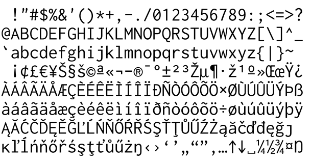
The snapshot on the main page doesn't come close to doing it justice, I implore you to take some time to look at the PDF display sheet, zoomed in to 800%. Pay particular attention to the "t", "v", "w", and "y" - not to mention the numerals.
Congratulations, Raph Levien.
1 comment:
I would take the i home. Or at least invite it up for coffee.
Post a Comment